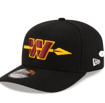
(New Poll) The Washington Commanders Brand 2.0: Beer Drinkers and Hail Raisers

How do you feel about the Commanders Brand 2.0?

  • Vastly improved, if this is THE brand moving forward I’m satisfied.

  • I like the direction, but I still feel more to do. I will/have specified in thread.

  • I don’t like this new direction. I didn’t like the old either. They can’t make this work for me.


Results are only viewable after voting.
I’m glad they didn’t change the W logo. I’m used to it. The spear version looks a little amateurish and honestly, what does a spear have to do with the name ‘Commanders’? Yes I know we once had a spear logo back I. The stone ages. I just don’t think it fits. I hope like hell they don’t make that the official logo. Sometime simpler is better. I like the black uniforms except for the spear in the logo.

I disagree on the spear for reasons stated above. But I also like the W.

I see a lot of people griping about the W online, which I think is largely just bitterness about losing the Wetzel logo it replaced, but really it is simple and iconic, like Green Bay’s G. Also, W stands for winning.
 
I prefer the aesthetic of the crossed spears versus the one through the W…but again for me thats a minor issue.
 
I love it. less is more - go completely back to our classic look. Even fixed the blacks - which I merely hated because I loathed TS's white abominations. Now I honestly like the blacks because they look like the Washington Redskins decided to do a an alt uniform, instead of looking like some goofy Steelers tribute to the military.

I don't see us being able to get any closer to our roots absent the almost nil chance of the logo's return.

This looks like my darn team as much as it will ever be able with the name we have. I am as happy as I could reasonably expect.

Now let's win some Super Bowls.
 
We'd ALL agree on the old logo :)

s-l400.jpg
 
I'm glad the glossy helmet is back,, but I did like that matte look. I'm satisfied with the new black uni,,much better color combo! #HAIL
 
The black uni color combo looks like it came from a fan made design if I recall.
 
The black uniforms look less like the Steelers, so that's good. I still don't like them, I am unimpressed that the throwback logo goes on the uniform that throws back to nothing. I like the primary uniforms. I think the spear through the logo looks goofy when you see it up close, but when viewing it from a player's helmet on the TV screen, I doubt I'd notice.

I grade B+.
 

Users Who Are Viewing This Thread (Total: 6, Members: 0, Guests: 6)

Help Users

You haven't joined any rooms.

    You haven't joined any rooms.
    Top