
It would be trademark, not copyright law. You can check to see if the spear when used in connection with football is already registered at the uspto.gov websiteIt’s been 23 years since we last wore those uniforms/spear helmets. Lots of things are different, including potentially the applicable copyrights and copyright laws involved. Who knows, but that’s a LONG time for things to change. And there’s a lot more money in the sport now, including at the college level. Exponentially more.

 }})
You are using an out of date browser. It may not display this or other websites correctly.
You should upgrade or use an alternative browser.
You should upgrade or use an alternative browser.
(New Poll) The Washington Commanders Brand 2.0: Beer Drinkers and Hail Raisers
- Thread starter Commander PK
- Start date



It’s been 23 years since we last wore those uniforms/spear helmets. Lots of things are different, including potentially the applicable copyrights and copyright laws involved. Who knows, but that’s a LONG time for things to change. And there’s a lot more money in the sport now, including at the college level. Exponentially more.
That's what I said..... that it could have changed between then and now.... i just didn't see why they would do it.
Also, copyrights don't protect brands, they protect original ideas, so to Chris' point, if they wanted to claim copyright, they can only copyright the exact logo... we would not copy them, it would be different, the same way it was on the 70th.
Last edited:


Riggo44
The Team Captain

They also have an agreement/partnership with the Seminole tribe.FSU’s helmet has a fucking feather on it.

ExoDus84
The Rookie
I like the idea of the spear, but not that spear. It looks flat, two-dimensional, and amateurish. Something more detailed with some depth and artistry would look far better; the fan render spear posted a few pages ago looks much better.
Still though, the black uniforms are significantly better. They no longer look like Temu Steelers.
Bringing back the old B&G jerseys with the new logo was a no-brainer, and they do look damn good. Burgundy helmet could use a color-contrast outline on the taco holder to make it pop, IMO.
B+ overall, according to this fan.
Still though, the black uniforms are significantly better. They no longer look like Temu Steelers.
Bringing back the old B&G jerseys with the new logo was a no-brainer, and they do look damn good. Burgundy helmet could use a color-contrast outline on the taco holder to make it pop, IMO.
B+ overall, according to this fan.


Putting all the negative feelings I have towards the Commanders brand aside, if this was a brand new expansion franchise that just revealed their new look today, people would be applauding what they pulled off with these. We as fans are stuck (and rightly so) clinging onto the gold standard of sports logos and are having a hard time letting go. That’s as straightforward as I can be.
I don’t like black uniform sets in general. but they are popular with the younger crowds and these were about as well done as they could have been.
I appreciate the effort in linking the past with the present. In many regards, Harris and Co. have been asked to make chicken soup out of chicken you know what and have executed it quite well.
My one gripe is the spear logo looks too big on the side of the helmet. Had they simply not had the spear extend outside of the W’s left outer edge, it would be a bit sharper in my opinion. Not to mention it would eliminate peoples’ complaint that the spear can’t physically go through the W the way it currently does.
I don’t like black uniform sets in general. but they are popular with the younger crowds and these were about as well done as they could have been.
I appreciate the effort in linking the past with the present. In many regards, Harris and Co. have been asked to make chicken soup out of chicken you know what and have executed it quite well.
My one gripe is the spear logo looks too big on the side of the helmet. Had they simply not had the spear extend outside of the W’s left outer edge, it would be a bit sharper in my opinion. Not to mention it would eliminate peoples’ complaint that the spear can’t physically go through the W the way it currently does.

- Joined
- Jul 29, 2009
- Messages
- 1,916
- Reaction score
- 1,972
- Points
- 278
That's an odd species of bird..FSU’s helmet has a fucking feather on it.

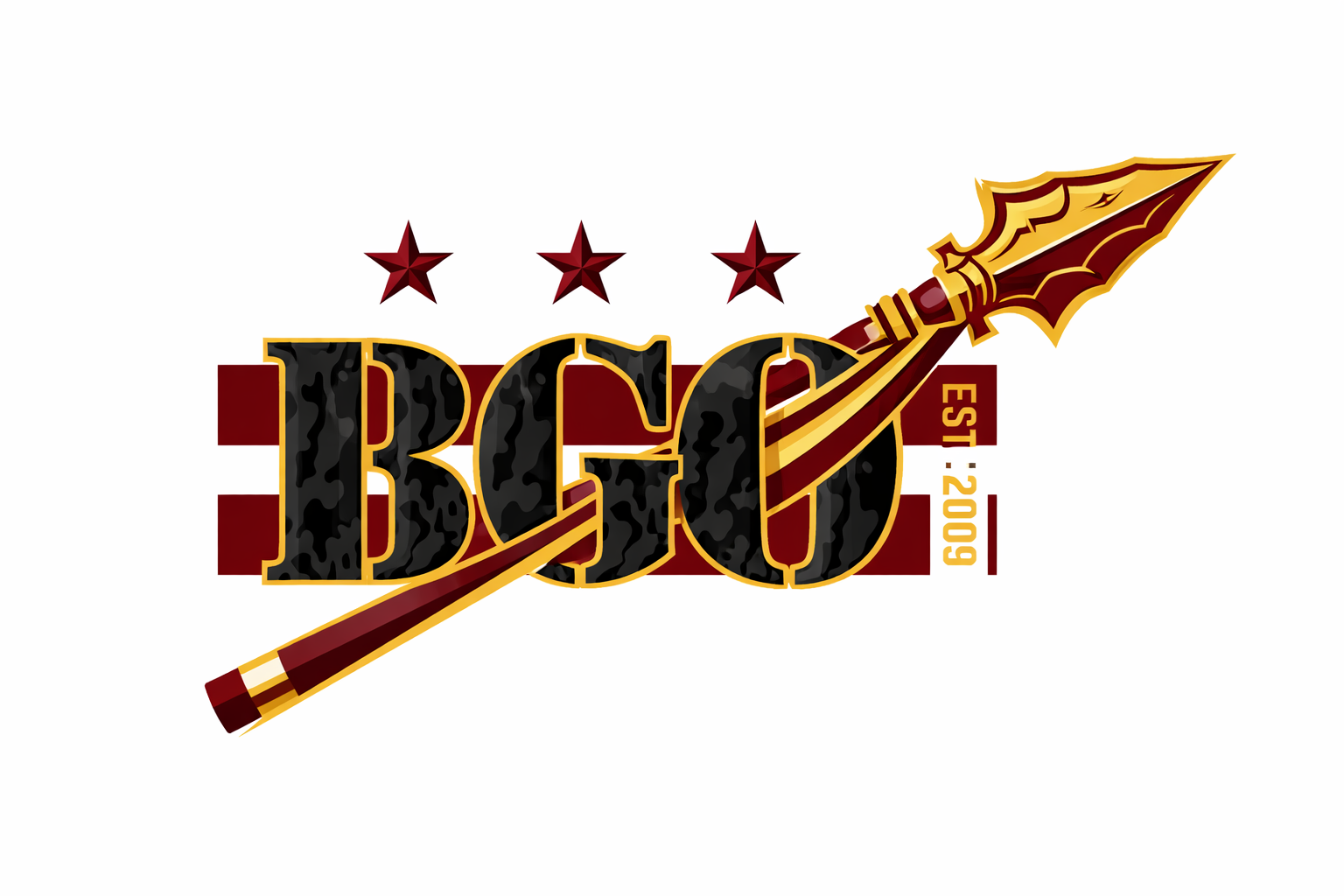
Boone, SilentThreat, Neophyte, Om…is BGO getting an alternate spear logo?! 😯
Good ol’ ChatGPT…lol

bifflog
The Rookie

I always enjoy these little diagrams...
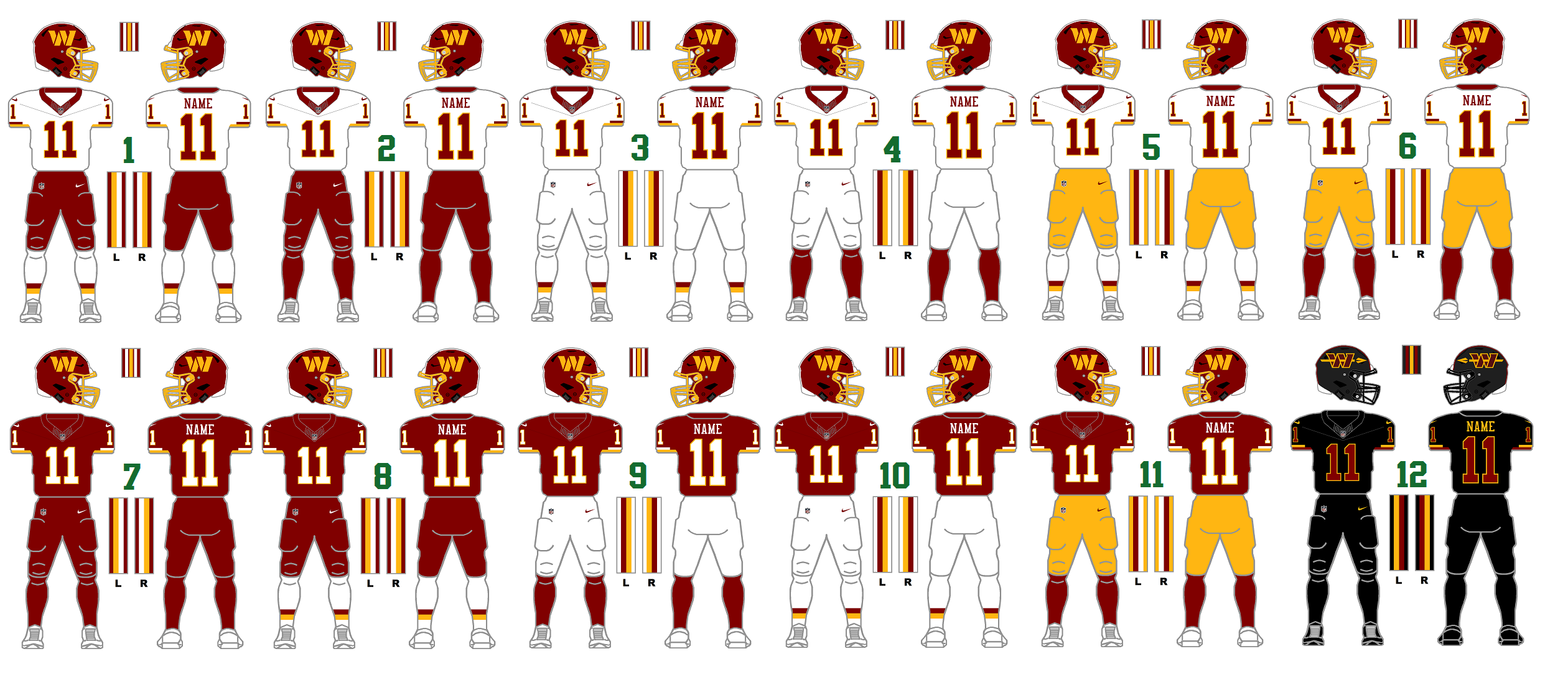

Love it!


- Joined
- Jul 15, 2009
- Messages
- 15,891
- Reaction score
- 9,225
- Points
- 1,093
- Location
- W Palm Beach & Helsinki
That's an odd species of bird..
My theme of the day. 😉


- Joined
- Oct 13, 2010
- Messages
- 1,344
- Reaction score
- 2,038
- Points
- 263
- Location
- Mechanicsville, MD
- Alma Mater

New Poll with three options. Let’s see where we are now.


Can we add a 4th option?New Poll with three options. Let’s see where we are now.
() I'd prefer logo of "Dan Snyder with a Spear through him"
- Joined
- Jul 15, 2009
- Messages
- 15,891
- Reaction score
- 9,225
- Points
- 1,093
- Location
- W Palm Beach & Helsinki
I voted vastly improved (but the arrow needs a bit of work).

AngryChuckT
The UDFA
I went with satisfied. If they did nothing else I am pleased because it feels like my darn team as much as it can with the name and NA imagery verboten.
If the wanted to tweak here and there - add the spear as the primary I would welcome that, but I don’t need it and will buy jerseys again and select other gear.
I feel like Harris and Co are about incrementalism and doing things with a plan. The reintroduction of the spear was well done with the Greco-Roman theme leading up. Makes it harder for the usual suspects to scream “NA Imagery!” Makes me think there is a long term plan to reintroduce things that done all it once would stir controversy. Name not coming back. But maybe slowly and incrementally the chances of the logo being worked back go from almost nil to 1%.
If the wanted to tweak here and there - add the spear as the primary I would welcome that, but I don’t need it and will buy jerseys again and select other gear.
I feel like Harris and Co are about incrementalism and doing things with a plan. The reintroduction of the spear was well done with the Greco-Roman theme leading up. Makes it harder for the usual suspects to scream “NA Imagery!” Makes me think there is a long term plan to reintroduce things that done all it once would stir controversy. Name not coming back. But maybe slowly and incrementally the chances of the logo being worked back go from almost nil to 1%.
- Joined
- Oct 13, 2010
- Messages
- 1,344
- Reaction score
- 2,038
- Points
- 263
- Location
- Mechanicsville, MD
- Alma Mater
I am satisfied if this is what we are now.
As I stated already, I would not have designed the arrow logo the way they did, but I understand why they did, and I understand there could very well be trademark implications in just using the spear by itself. As I’ve looked closer at the helmet from the front all you can see is the arrowhead for the most part anyway.
Once this door opened again with the new ownership, I was excited for the chance to get something else. I think they have done an admirable job of trying to bridge the old with the new as much as possible. Something that we lost with the original rebrand was the ability to wear a Riggins or a Monk jersey that looks just like a Daniels or McLaurin jersey, and is actually the same jersey that all four of those players have worn. One could argue that the visual identity is more important than the actual name of the team. I think what we will see now over the next several years is just tweaks and maybe a few more variations but our core identity for this franchise IMO has been reestablished. I’m feeling good about it, and I hope the majority of you are.
As I stated already, I would not have designed the arrow logo the way they did, but I understand why they did, and I understand there could very well be trademark implications in just using the spear by itself. As I’ve looked closer at the helmet from the front all you can see is the arrowhead for the most part anyway.
Once this door opened again with the new ownership, I was excited for the chance to get something else. I think they have done an admirable job of trying to bridge the old with the new as much as possible. Something that we lost with the original rebrand was the ability to wear a Riggins or a Monk jersey that looks just like a Daniels or McLaurin jersey, and is actually the same jersey that all four of those players have worn. One could argue that the visual identity is more important than the actual name of the team. I think what we will see now over the next several years is just tweaks and maybe a few more variations but our core identity for this franchise IMO has been reestablished. I’m feeling good about it, and I hope the majority of you are.
Vastly improved. A minor tweak with the logos on the helmets and it would be best possible option
AngryChuckT
The UDFA
This is a huge point. Wearing my Riggins or Green Jersey while my son wears a SB Era Daniels or TMC SB era jersey is a massive point for continuity of tradition and memories handed down through the generations.Something that we lost with the original rebrand was the ability to wear a Riggins or a Monk jersey that looks just like a Daniels or McLaurin jersey, and is actually the same jersey that all four of those players have worn. One could argue that the visual identity is more important than the actual name of the team.
The WOS and Mrs. WOS dreck never felt like an evolution of my beloved franchise - it felt like an expansion team trying to erase the past. Huge difference and probably the biggest part of most folks ire. Some will never be able to let go of the old name and logo -and I understand it because for a few years I didn’t think I could - but it makes it hard to let go when you do everything in your power to erase the past short of changing the official colors.
Skins posted pics on FB from the fan rally tonight. Everyone should check out the post. People mixing the old with new. The pics just feel right and I wish I wasn’t a 1000 miles away or my son would be there in Skins and Commanders gear.
Users Who Are Viewing This Thread (Total: 6, Members: 0, Guests: 6)
Who Read This Thread (Total Members: 86) Show all
- ntotoro
- Blaze Thunderball
- SkinsInSATX
- BrotherDP
- NickyJ
- Picture Drawer
- HOF44
- Lupin IV
- SkinsGuy99
- Voice_of_Reason
- SmiffySkins
- Dah-Dee
- Conn
- RedWolf
- Spearfeather
- Ekimotama
- mackjr1962
- Faithful Fan
- Busch1724
- ArtMonkWasMyHero
- LH9060
- AngryChuckT
- Chris
- KitKat
- Hailer
- BabelRich
- RedskinInCO
- Anne The Fan
- burgold
- JoeyG
- HTTR
- Canuck
- pwyl
- Ferndaleskins
- Ashburn Dave
- Skintime
- Fansince69
- UK Skins
- Boone
- Maglite to the Face
- Duncan
- Single-Bar Facemask
- Phantvm
- RFK Lives
- Whiskeypeet
- Kpmjames75
- Ben Wyatt
- Rakpo98
- Knightingale
- Skinfanjon
- Halcyon Times
- 0rder 0f 0ut
- Enforcer
- bowhunter
- Captain James
- skinzplay
- HailYeah
- FanSince71
- Primus Porcus
- McD5
You haven't joined any rooms.