Time for a Cool Change

Om

Burgundy & Gold Jacket
Staff member
Joined
Apr 11, 2009
Messages
10,246
Reaction score
1,578
Points
593
Location
Montclair, VA
Most of you have been around since BGO’s launch and seen the evolution of our look. As those who accept the theory know, evolution is largely reactive to changes in environment.

The Washington Redskins/Washington Football Team/Commanders have undergone such a change. I’m thinking it’s time for BGO to evolve with it. Not the whole site—changing the entire “skin” is a monster-bitch undertaking—just the logo.

Our brand.

1644238415118.png


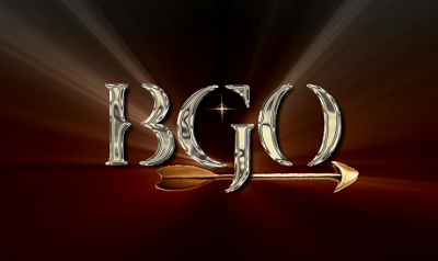
Our current logo, sweet as it is, contains imagery that is no longer part of the team's graphic identity. The native profile and feathers, much as I love them, don’t reflect where we are any more. For better or worse that's the new reality (also, part of me has always kinda regretted that we didn't incorporate any actual BURGUNDY into our Burgundy and Gold Obsession logo).

So ... now that we’re a collective ownership group, I’d like to solicit your thoughts and talents to consider and craft a new BGO logo. We have among us some talented graphics types, and a whole lot of passion for the team, the site, and what it is this place means to each of us.

What say you? We could do it “in house,” just among staff … we could come up with guidelines and post them up on the board to solicit the genius of the membership at large … we could do a contest of some kind … we could hire focus groups, spend two years teasing it, then tell people at various stages along the way that in the end it will not be any of their actual top choices, hype the hell out of the unveiling, and then finally roll out something generally milquetoast and meh.

We have the power.

__________________________


A little history/context just for fun ...

Some of you may remember that the Skins/NFL contacted us at some point and told us that the BGO logo contained copyrighted elements (the Indian and feathers) that we needed to remove or face possible legal action. The Danny/Commish don’t play. So after much cussing and chest-puffing and all manner of other righteous indignation, we decided we’d change it because legal fees are stupid expensive.

We did have a temporary filler:
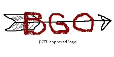

BGO_nfl_app_sized.png


And then, after MANY experiments and false starts (here are but a few):

AlphaFlight180_sized.png


quakearrow_sized.png


BlendedFade.png


overlay_sized.jpg


IkarusBlend_sized_2.png


(I don't remember being so enamored of the starburst thing. Weird.)

In the end, we ended up with this … which, now that I look at it with fresh eyes, was generally kind of meh.


logo_2_sized.png


Then at some point—can’t recall exactly when or why—we decided to say fuck it and reinstalled the original logo. We can’t be stopped, one can only hope to contain us.

I hesitate to come up with too many restrictions, but based on the specs and experience ...

General parameters:

- The new logo needs to “work” with both the black and white templates.

- As hinted at above, I think the new logo should absolutely incorporate burgundy AND gold.

- To avoid potential hassle down the road, it should probably NOT use the new “W” or “Commanders.” The team is going to be highly sensitive to that for the next few years.

- The black header space is 200 pixels tall, so logos should be sized 180-190 pixels tall. Width is negotiable … for reference, the current logo is 400 pixels wide, but if your creative genius needs more lateral space, and it works with the overall look/feel of the site, listen to your muse.

Attached are screencaps with blank header spaces to play with if you feel so inclined.

Onward and upward.

 

Attachments

  • template_b.png
    template_b.png
    271 KB · Views: 113
  • template_w.png
    template_w.png
    292 KB · Views: 107
Thanks for this thought and doing some legwork Markus :cheers:

Couple quick comments. I *think* Mark is misremembering the part about the team contacting us (that may have occurred with Extremeskins, but I don't believe they ever contacted us). I think I just got paranoid because we were trying to get gear/swag made and we kept getting rejected because the logo contained parts of the official NFL logo. I don't think we were ever big enough to warrant their attention to be honest. I could be wrong, that's just how I remember it. But the point of that is, one big downside to using official elements is that if we ever do want to do t-shirts or hats with site logo, it's a lot more challenging.

On the logo dimensions, the current logo is 454 x 200 pixels, and 200 is the max height of the image with current settings. 200 tall will fill the entire logo height (since it's black background we don't notice it currently, appears the logo is just floating).

I'm on board that it makes sense to update. It pains me a little, because I think we'll be hard pressed to ever come up with anything close to being as beautiful as our current one. But it doesn't make much sense to have a logo with feathers and the indian face for a totally different team. We may not want to be too restrictive, for example they can use elements of the DC flag, just not exact copies of the team graphic like the 'W'...

I think they need to use the site name in the logo - either BGO or 'Burgundy and Gold Obsession', but it doesn't have to resemble the current logo in any way.

Another thing to mention - it needs to work well on both a PC/Laptop view and the mobile view or create two similar versions, one for full site and one for mobile.

I suggest Mark put it out to the whole membership. Most of the active ones are owners/staff anyway. Also - we don't have a great history of folks even reading threads in the staff forum - so most won't see this. If we want to do a contest, cool with me. I'd also suggest that since not everyone is a graphics expert, folks should just be able to submit a mock up. Hoping that if an idea/mock up stands out above others, we can put Pete to work to create the final product? And the more submissions the better (don't limit it to one per member).

I think it's possible, we go to the trouble of framing all this and putting it out there, and get cricket chirps. It wouldn't surprise me. If that happens, suggest we go old school and whichever ones of us that care work with Pete to come up with our own logo.
 
Last edited:
Let's give folks a few days to find/weigh in on this here, and unless there is sentiment NOT to open it to the board we'll plan to post it on the main board by the weekend.

I'll defer to John on why we canned the original logo over licensing concerns--I'm older and forget quicker. lol
 
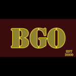
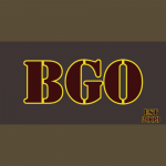
I am NOT a graphic designer, but just so you guys didn't get tumbleweeds in here, I thought I'd have a dabble for an hour or so.

Here's my efforts, i'm sure someone could make them look better than I did. LOL

My reasoning...

1) Trying to play a little off what the new Commanders logo sort of looks a little like
2) Trying to get a military feel in there
3) Making a clean logo that can be adjusted to different color sets, so if you felt like rotating them you could.
4) Keeping the Burgundy/Gold/White that we know and love, but also incorporating Black for those times when we go alernate.
5) Wanted to slip HTTR into there in a subtle way. (Morse Code across the top! It'll always be a hint towards us being the Reskins!)
6) I'm sure I have the EST year wrong, but it was just an example.

Anyhow, I'm laying down the first gauntlet for others to come and inevitably beat. :D

In White.....
BGO White.png


In Gold.......
BGO Gold.png


In Burgundy....
BGO Burgundy.png


In Black...
BGO Black.png
 
Bro. :)

LOVE the stealth Morse.

Thanks for diving in ... away we go!
 
Please copy this into the public thread when it’s available… and ditto on the Morse code which I was once proficient in. Est 2009 btw :)
 
I know this is snarky and petty but I’d love to incorporate the championship years into the logo 🙂
 
Last edited:
Love the Morse Code, btw. I would have never picked that up
 
You say 2009, Boone, but I'm running off the new rules for deciding dates. You say 2009, but you obviously mean 2010... Apparently that's the way it works now.

I wanted to keep a sneaky reference to the HTTR. I toyed with putting hte championship years in the stars, but thought it might be too cluttered. Like this...

BGO Burgundy SBYears.png


Anyway, might be some ideas in there to play off.

The morse code played into the military feel a bit.

Anyway, just wanted to get the ball rolling.
 
Last edited:
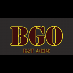
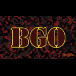
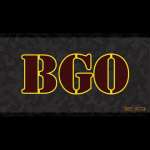
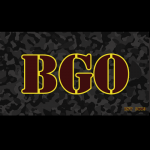
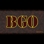
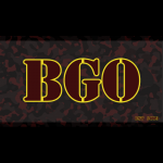
a handful of variations, trying to keep it somewhat similar but a little spin... Camo a little homage to Commanders..
 

Attachments

  • CC_Express_20220208_2126130.41399387785663133.png
    CC_Express_20220208_2126130.41399387785663133.png
    19.5 KB · Views: 91
  • CC_Express_20220208_2128320.24570424555267856.png
    CC_Express_20220208_2128320.24570424555267856.png
    20.2 KB · Views: 92
  • CC_Express_20220208_2130390.32308746937518407.png
    CC_Express_20220208_2130390.32308746937518407.png
    22.6 KB · Views: 91
  • CC_Express_20220208_2135060.009179684578473513.png
    CC_Express_20220208_2135060.009179684578473513.png
    191.5 KB · Views: 98
  • CC_Express_20220208_2136450.3253001290374574.png
    CC_Express_20220208_2136450.3253001290374574.png
    94.8 KB · Views: 98
  • CC_Express_20220208_2135450.43780250213611205.png
    CC_Express_20220208_2135450.43780250213611205.png
    131 KB · Views: 96
  • CC_Express_20220208_2137320.6943749549127501.png
    CC_Express_20220208_2137320.6943749549127501.png
    84.2 KB · Views: 91
  • CC_Express_20220208_2138140.270965983691405.png
    CC_Express_20220208_2138140.270965983691405.png
    139.5 KB · Views: 101
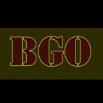
thinner outline and a 'military green' type bacground... i think i like the tinner outline much better, but wont annoy you all with re-producing the ones above with that feature..
 

Attachments

  • CC_Express_20220208_2214510.5566716339085614.png
    CC_Express_20220208_2214510.5566716339085614.png
    18.9 KB · Views: 85
Great stuff so far. Why not go ahead and open a thread since this seems to be becoming the thread :) (or just move it to an open forum).Yeah, thinner text border looks better. I think 2 colors on smaller text like ‘est 2009’ makes it too difficult to make out. Maybe just solid gold there?

Worth considering whether we want transparent background versions because when you use a colored background it’s going to look like a ‘box’ in the header. And that’s fine if folks like that look but we’ve preferred the black background to date where logo appears to float.

We have to retain the black header because over 3000 images in the rotating image banner have black frames so if we alter the header color we will not be able to continue with that feature. We don’t have to continue that but I would vote we do if only because it’s probably the largest collection of images anywhere with some rare ones included..

A great start. I will throw some ideas out there this weekend when I have time. What font is that you are using ST? Before we go too far down the ‘military’ path, we may want to consider whether that’s really going to be a big aspect of the new name. Obviously ‘Commanders’ is vaguely military and there is a small amount of camo on the black uniform, but to what degree the whole theme is ‘military’ remains to be seen. I’m not even sure they know yet.
 
Yeah, I'll redo the OP on the board and wait for Knightingale and ST to repost their stuff before commenting more ...

When I do will definitely agree with Boone that we need to use a black background so it works with our template header and the rotating banner feature.

Oh, and I may have played a bit this morning with the two main themes that have already come up. Very fancy graphic work on Microsoft paint. ;)


bgo_new.png
 
Erg. Now that I look at it it may look a little too stark and ... Soviet?
 
Hey - this is a time to throw stuff on the wall, not even worry about a final product…

I am not saying the logo itself HAS to be on a black background, but whatever we land on will be on a black header unless we dispense with the rotating image banner.

As we hone in on some we like it will be good to plug them into the screen caps Mark included to get an idea what they’ll look like actually in that header space
 
I love the *idea* of the Morse code, but not sure many would ‘get it’ or that it’s visually appealing…
 
Yeah, agreed. I did that with the Commrade-looking one I did and it didn't quite sing.

Referring to the plugging into the template, btw. Not to the Morse code thing. Agree that it would have to be done "right." Good thing we have graphic artists on the payroll!
 
It's a 'stencil' font. I threw that together on Adobe Creative Cloud on my tablet which is at home... let me see if i can dig it up.
 
I THINK I found it... take a look at Stencil STD Bold and apply an 'outline' to it
 

Users Who Are Viewing This Thread (Total: 1, Members: 0, Guests: 1)

Help Users

You haven't joined any rooms.

    You haven't joined any rooms.
    Top