(New Poll) The Washington Commanders Brand 2.0: Beer Drinkers and Hail Raisers

How do you feel about the Commanders Brand 2.0?

  • Vastly improved, if this is THE brand moving forward I’m satisfied.

  • I like the direction, but I still feel more to do. I will/have specified in thread.

  • I don’t like this new direction. I didn’t like the old either. They can’t make this work for me.


Results are only viewable after voting.
At the risk of shocking my good friend Primus Porcus, who rightfully mentioned recently what a die-hard critic I am of anything associated with the name debacle and the 'brand'....

I voted 'Vastly improved'.

First of all, the reason why we are likely sticking with the 'W' in some form long-term is multi-fold. 'Washington' is now the brand. They have communicated this in a number of ways. The seeming unavailability of an alternate name that the vast majority of the fanbase would embrace leaves them no choice but to double down on 'Washington' and live with whatever follows it. There is no real 'logo' that clearly would reflect 'Commanders'. They have scrubbed the uni's of any mention of 'Commanders'. Commanders has zip to do with anything Native American and they are smart to move away from that idea and pivot to a vaguely military theme (whether it be greco-roman, medieval, or other vibe). The spear (I don't think) is intended to be a Native American symbol - it's just a general 'warrior' icon.

'W' is the best identifier we can have at this point. If they were to create some new logo and try to clean up 'Commanders' somehow and more clearly define it, it would be jarring as hell to this fanbase. They won't ever go back to having the Native American logo not because they 'can't', but because in the context of the 'Commanders' name, that logo makes NO SENSE. Its possible they might run it out there as an alt uniform at some point just to honor the past, but I think it's gone forever as the main logo and honestly it should be.

On the new uniform roll out - I have learned that my first reaction sometimes isn't a lasting one. I am averse to change to an extent so when I saw the spear logo it didn't land well at first. I like consistency and part of me just wants them to decide on a permanent logo and be done with it. So the idea of having two logos isn't generally appealing to me. At first glance, like a lot of you, the spear looked weird to me. But listening to Al Galdi (who loves the new uni's) made me look again and try and keep an open mind. The spear is large. But I think they did it that way so that it could be seen from the front on the black helmet. It actually is rapidly growing on me and I like that you can see the two spears from a frontside view. They more or less nailed the color scheme on the black uniforms and it no longer looks like a Steelers East uniform. Maybe the spear needs some work, but honestly, a year from now when we are used to it, I doubt folks will be screaming for a new version of it. We don't need feathers - because again, they are moving on from Native American imagery (largely because you can't link it to the actual team name any more). We probably need to stop screaming 'add a feather to it' - I think some of you stared at that ES logo too many times and just can't let it go.

I care less about the 'brand' and uniforms than almost anyone here. But I do think they are doing a good job of trying to meld lots of things together that don't naturally fit. The new guys inherited the biggest brand mess in NFL history so the fact that they aren't completely screwing the pooch on improvements is praise worthy. And if I AM SAYING THIS, that speaks volumes.
 
I have been thinking about this since I ordered my black alt logo hat the day they unveiled these. How did I go from hating the black alts to buying a hat?

Initially I thought it was because it is such an improvement over The WOS and Tanya’s Great Value Brand Steelers Uniform (that unfortunately will be forever linked to one of the greatest plays in franchise history.)

But then I realized it is more than that. A lot of teams have done alt black uniforms as a revenue generator. In an alternate universe where 2020 never happens and the Washington Redskins jumped on the alt black uniforms fad, I imagine the uniforms would look very similar to what they unveiled Wednesday. The alt blacks feel like the Redskins despite being a color we haven’t used as a primary before.

We can debate all day whether Harris and Co. should (or even could change the name again), but I have come to believe they have done a masterful job turning lemons to lemonade within the confines of a goofy name and social issue landmines surrounding the franchise branding history. I mean Holy Crapola -they got me, who railed against black alts in conversations with friends and family, to buy a hat I am going to pair with my old Redskins jerseys. Has more the soul of my beloved franchise than any of the absolute vomit WOS, Tanya, and Nike tried to foist on us.

#metoo
 
Well that didn’t take long. Imagine if a feather had been incorporated.

“The Washington Commanders' decision to update their logo is disappointing and inappropriate to say the least,’’ the Association on American Indian Affairs said in a statement provided to USA TODAY Sports. “It is time to stop repeating this cycle and listen to Native Peoples who have been clear, consistent, and unwavering on this issue: We are not your mascot.’’

Suzan Harjo, a Native American activist who was part of two lawsuits designed to force the team to change its previous mascot and name, said she thinks the team is being disingenuous -- trying to appease people who want to bring back the old mascot.

“There are a lot of people in Washington D.C. (and parts of Virginia and Maryland) who really long for the days of the dreaded R-word,’’ Harjo said, referring to the team’s previous nickname. “It was a vile name. It was one of the vilest ever.’’


And that’s why they laid the groundwork for over a year with all the Roman legionnaire/vaguely medieval-adjacent architecture stuff in photo shoots with players. Not because they’ll need that plausible defense in court or anything, but to give just enough context so that everyone else who feels so inclined can get into the mud and wrestle around with the critics that they’ll likely just politely ignore
 
Hoo boy. If Suzan et al. were crusading over a 90-10 issue before this has got to be a 99.9-.1 issue now.

Thank you for your submission the court of public opinion has dismissed your case.

Yes Conn this reinforces the quality of the work the team has put into defining the Commander identity. And while I understand the sentiment of the crew that argues “just go back to Redskins and say screw the Suzan Harjos of the world” .. that’s a much more difficult path than the already difficult one they’ve chosen, which is to make do with Commanders.

So far so good IMO
 
For all those who keep complaining they won’t bring the logo back….I REST MY CASE.

Now a vague spear through a letter is offensive to them also.
 
The bottom line is they got what they wanted. The old name is gone the old logo is gone.

Now if we use a spear logo that has been used by every group of human warriors since the dawn of time they have a problem with that also. Why doesn’t Suzan pick on somebody else for a change? Like the teams that still have a Native person in their logo.
 
That feels like such an attempt to get back in the spotlight, and it would shock me 0.0% if you were to tell me USA Today instigated it up for a cheap story. The spear cannot be linked back NA imagery, the only link is our old uniforms, and it's blatantly obvious they deviated from it to give it it's own brand. To get mad at us, while letting the Florida State Seminoles have their helmets, simply because they give money to the Seminole tribe removes all validity in the argument. You're either ok with it, or you're not. Complaining about it now proves it's all about money, and not a single bit about 'not being a mascot'
 
Last edited:
Well that didn’t take long. Imagine if a feather had been incorporated.

“The Washington Commanders' decision to update their logo is disappointing and inappropriate to say the least,’’ the Association on American Indian Affairs said in a statement provided to USA TODAY Sports. “It is time to stop repeating this cycle and listen to Native Peoples who have been clear, consistent, and unwavering on this issue: We are not your mascot.’’

Suzan Harjo, a Native American activist who was part of two lawsuits designed to force the team to change its previous mascot and name, said she thinks the team is being disingenuous -- trying to appease people who want to bring back the old mascot.

“There are a lot of people in Washington D.C. (and parts of Virginia and Maryland) who really long for the days of the dreaded R-word,’’ Harjo said, referring to the team’s previous nickname. “It was a vile name. It was one of the vilest ever.’’


I hate that I gave the USA Today clicks and read that shlock. Apparently, NA activist groups have a trademark on spears to the point that Greco-Roman Spears are offensive or something? I remember when they rolled out the rebrand and there were critics about keeping the colors because somehow the colors = racist.

If anyone quoted in there mentioned the Chiefs, Blackhawks, Braves, and Seminoles I might give a listen, but the hypocrisy has me tuning out. Sorry you don’t get to tell me how racist a Greco-Roman spear is while the Chiefs do the tomahawk chop.

Harjo can a take a trip down F-Off Boulevard.
 
We are Washington…and our penance for Redskins is we can never be happy again according to Suzan.

It's a silly, grasping statement from Suzan Harjo.

There are many many ancient cultures and ancient armies that used spears in training and battle. Not just Native Americans.

There certainly weren't any Indian people who referred to anyone in their tribe as "commanders".

Sounds like Ms. Harjo is trying to stir things up to get money from the virtue signalers who greased her before. 🙄
 
And that’s why they laid the groundwork for over a year with all the Roman legionnaire/vaguely medieval-adjacent architecture stuff in photo shoots with players. Not because they’ll need that plausible defense in court or anything, but to give just enough context so that everyone else who feels so inclined can get into the mud and wrestle around with the critics that they’ll likely just politely ignore

Yepppp, people can pick nits over some details and the on-field situation last season was a little bit of cold water but this just demonstrates the new level we're playing at under new leadership. They put in the time to and work to make the case, and there is a reluctance to be too greedy. They could have put the spear logo on all of the helmets immediately, but they didn't. That way, anyone who may be sympathetic to the (silly) point being made here will not be inclined to get too worked up about it because hey, it's two games a year? And after a few years of that, shifting it to the permanent helmet logo will change the narrative to "Well, they were already wearing this, so it must be fine." Just shows how you have to play this PR game, if we had the folks in charge now back in the 2010's we would have navigated our way to a much more satisfactory conclusion than we ended up with.
 
It's a silly, grasping statement from Suzan Harjo.

There are many many ancient cultures and ancient armies that used spears in training and battle. Not just Native Americans.

There certainly weren't any Indian people who referred to anyone in their tribe as "commanders".

Sounds like Ms. Harjo is trying to stir things up to get money from the virtue signalers who greased her before. 🙄

As much as I supported changing the name, this is getting ridiculous. As you said, a spear is a universal weapon (like AK-47s), and there's nothing on the spear to connect it with any specific culture. Sometimes I feel these 'rights groups' don't want to solve the problems they were created to address, since that means they would no longer be relevant and have to find other work.

Enough already!
 
But will it help them win more games? Looking better while losing is still, losing.
 
Well that didn’t take long. Imagine if a feather had been incorporated.

“The Washington Commanders' decision to update their logo is disappointing and inappropriate to say the least,’’ the Association on American Indian Affairs said in a statement provided to USA TODAY Sports. “It is time to stop repeating this cycle and listen to Native Peoples who have been clear, consistent, and unwavering on this issue: We are not your mascot.’’

Suzan Harjo, a Native American activist who was part of two lawsuits designed to force the team to change its previous mascot and name, said she thinks the team is being disingenuous -- trying to appease people who want to bring back the old mascot.

“There are a lot of people in Washington D.C. (and parts of Virginia and Maryland) who really long for the days of the dreaded R-word,’’ Harjo said, referring to the team’s previous nickname. “It was a vile name. It was one of the vilest ever.’’


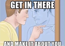
The AAIA, Harjo, and I can assume the NCIA when this team does anything:

1776439797933.png


They literally complained about the colors of the previous uniforms. They complained about using a wolf when Redwolves was a favorite. Unbearable.
 

Users Who Are Viewing This Thread (Total: 1, Members: 0, Guests: 1)

Help Users

You haven't joined any rooms.

    You haven't joined any rooms.
    Top