
 }})
You are using an out of date browser. It may not display this or other websites correctly.
You should upgrade or use an alternative browser.
You should upgrade or use an alternative browser.
(New Poll) The Washington Commanders Brand 2.0: Beer Drinkers and Hail Raisers
- Thread starter Commander PK
- Start date



Dlts20
The Starter
Yea most seem to have wanted it without the W like the pics that were floating around. Those spears were multi colored and on a curve/angle. Hopefully it looks better on the helmetsThat optical illusion spear through the W would be a whiff.
I’ll withhold disappointment till I see it actually released.

Spearfeather
The 1st Round Pick
That logo wouldn't work on the helmet, with the holes in some of the modern helmets being where they are, etc.


- Joined
- Jul 15, 2009
- Messages
- 15,891
- Reaction score
- 9,225
- Points
- 1,093
- Location
- W Palm Beach & Helsinki
Holy Walmart, Batman. 😡

ExoDus84
The Rookie


Command The Best
The Rookie
Looks like a 10yr old used their parents Cricut Machine and came out with that and placed it on a sweatshirtThat optical illusion spear through the W would be a whiff.
I’ll withhold disappointment till I see it actually released.


- Joined
- Oct 13, 2010
- Messages
- 1,344
- Reaction score
- 2,038
- Points
- 263
- Location
- Mechanicsville, MD
- Alma Mater

I’m calling bullshit on that being legit.
- Joined
- Oct 13, 2010
- Messages
- 1,344
- Reaction score
- 2,038
- Points
- 263
- Location
- Mechanicsville, MD
- Alma Mater
I actually like the W logo, and I like the spear, but definitely not combined like that. The combination weakens them both. I don’t think this could possibly be real. If you compare that to the shield with the crossed spears behind it, this looks amateur hour.

Maglite to the Face
Camp Fodder
Maybe the Ghost of Jason Wright haunts this team...wait, he's still alive.
- Joined
- Oct 13, 2010
- Messages
- 1,344
- Reaction score
- 2,038
- Points
- 263
- Location
- Mechanicsville, MD
- Alma Mater

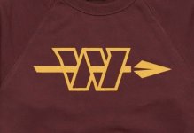
Look at what we know to be legit up top compared to what they’re saying this is on the bottom. The spears don’t even match in style. Design DNA doesn’t match here at all.


Riggo44
The Team Captain

He said AN alternate logo. I have a feeling that's a logo for merchandise. I hope anyway.
I hope they don't whiff tomorrow. These uniforms have been so built up, there is bound to be some letdown
I hope they don't whiff tomorrow. These uniforms have been so built up, there is bound to be some letdown

Yes! the look is rather....boring.That optical illusion spear through the W would be a whiff.
I’ll withhold disappointment till I see it actually released.
- Joined
- Jul 15, 2009
- Messages
- 15,891
- Reaction score
- 9,225
- Points
- 1,093
- Location
- W Palm Beach & Helsinki
I cannot wait to see all the ranting and raving here tomorrow!
If that pathetic, amateurish logo is real (I don’t think it is) there will be a lot of ranting and raving but none of the extreme enthusiasm or excitement variety.

SkinsInSATX
The UDFA
- Joined
- Oct 13, 2010
- Messages
- 1,344
- Reaction score
- 2,038
- Points
- 263
- Location
- Mechanicsville, MD
- Alma Mater
If that is a logo design, strictly for sweatshirts that I won’t buy, I will be happy. If that replaces the current W as the primary, or is on a helmet that way…I will be extremely upset. By combining them both that way, both are weaker.
Give me the W by itself give me the spear by itself. There’s no need to combine them both like that. Makes the whole thing look unnecessarily busy.
Give me the W by itself give me the spear by itself. There’s no need to combine them both like that. Makes the whole thing look unnecessarily busy.
- Joined
- Jul 15, 2009
- Messages
- 15,891
- Reaction score
- 9,225
- Points
- 1,093
- Location
- W Palm Beach & Helsinki
If that is a logo design, strictly for sweatshirts that I won’t buy, I will be happy. If that replaces the current W as the primary, or is on a helmet that way…I will be extremely upset. By combining them both that way, both are weaker.
Give me the W by itself give me the spear by itself. There’s no need to combine them both like that. Makes the whole thing look unnecessarily busy.
Command The Best posted that it looks like the work of a 10 year old. I think he was being generous. 😉
Users Who Are Viewing This Thread (Total: 1, Members: 0, Guests: 1)
Who Read This Thread (Total Members: 86) Show all
- ntotoro
- Blaze Thunderball
- SkinsInSATX
- BrotherDP
- NickyJ
- Picture Drawer
- HOF44
- Lupin IV
- SkinsGuy99
- Voice_of_Reason
- SmiffySkins
- Dah-Dee
- Conn
- RedWolf
- Spearfeather
- Ekimotama
- mackjr1962
- Faithful Fan
- Busch1724
- ArtMonkWasMyHero
- LH9060
- AngryChuckT
- Chris
- KitKat
- Hailer
- BabelRich
- RedskinInCO
- Anne The Fan
- burgold
- JoeyG
- HTTR
- Canuck
- pwyl
- Ferndaleskins
- Ashburn Dave
- Skintime
- Fansince69
- UK Skins
- Boone
- Maglite to the Face
- Duncan
- Single-Bar Facemask
- Phantvm
- RFK Lives
- Whiskeypeet
- Kpmjames75
- Ben Wyatt
- Rakpo98
- Knightingale
- Skinfanjon
- Halcyon Times
- 0rder 0f 0ut
- Enforcer
- bowhunter
- Captain James
- skinzplay
- HailYeah
- FanSince71
- Primus Porcus
- McD5
You haven't joined any rooms.