
The crest is infinitely better than that W, hands down. Some kind of incarnation that removes the years from the bottom would look great (don't wanna say to the world that those are the only years we'll be champs).

 }})
You are using an out of date browser. It may not display this or other websites correctly.
You should upgrade or use an alternative browser.
You should upgrade or use an alternative browser.
(New Poll) The Washington Commanders Brand 2.0: Beer Drinkers and Hail Raisers
- Thread starter Commander PK
- Start date


Sad to say, I do not like much, save for the winning.
Uniforms: Don't like them, especially the black ones. Just use any uniform from 1969 to 2015 or so. Hell I even liked those throwback ones they used a few times back in the 90s.
Logo: Good God, who thought that a good idea? Use a block W or throw the Lerners some money and share the curly W.
Major Tuddy: Well, Chief Z and the Hogettes have gone to the great yonder (RIP). I have no strong feelings re MT. Tie goes to the runner. The pigman can stay.
Raise Hail: Largely harmless. Fine.
Fight song: If Snyder, Harris, and legions of fans had taken my idea (Redhawks), we would be happily singing the victory song for years to come.
Crest: It's ok except it says Commanders.
Current Stadium: It has never been the greatest. But now that FedEx's tooty fruity colors are gone and there are more fans in the stands, it looks better. Which brings me to ...
Future Stadium: I despise domes and futuristic stadiums. Build a larger replica of RFK with all mod cons. Or build a bowl like the Rose Bowl. Build something NICE.
Sincerely,
A cranky, ole Redskin
Uniforms: Don't like them, especially the black ones. Just use any uniform from 1969 to 2015 or so. Hell I even liked those throwback ones they used a few times back in the 90s.
Logo: Good God, who thought that a good idea? Use a block W or throw the Lerners some money and share the curly W.
Major Tuddy: Well, Chief Z and the Hogettes have gone to the great yonder (RIP). I have no strong feelings re MT. Tie goes to the runner. The pigman can stay.
Raise Hail: Largely harmless. Fine.
Fight song: If Snyder, Harris, and legions of fans had taken my idea (Redhawks), we would be happily singing the victory song for years to come.
Crest: It's ok except it says Commanders.
Current Stadium: It has never been the greatest. But now that FedEx's tooty fruity colors are gone and there are more fans in the stands, it looks better. Which brings me to ...
Future Stadium: I despise domes and futuristic stadiums. Build a larger replica of RFK with all mod cons. Or build a bowl like the Rose Bowl. Build something NICE.
Sincerely,
A cranky, ole Redskin


- Joined
- Apr 11, 2009
- Messages
- 55,807
- Reaction score
- 17,399
- Points
- 2,743
- Location
- Greensboro, NC
- Military Branch

- Alma Mater

I think one thing it might be savvy to do, rebuild the uniforms without ‘Commanders’ on them anywhere. If a big chunk of the fanbase despises it, minimize it. That way folks will want to buy and wear swag without having the name slap them upside the face.

- Joined
- Feb 22, 2010
- Messages
- 259
- Reaction score
- 60
- Points
- 43
a simple W would be good to me. Symmetrical I think looks best. Something that looks like it could have been their logo in the 50s or 60s. These are old Washington Senators Block W's with the colors changed.
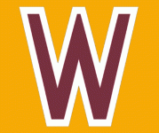

I would also suggest including a decent Washington Football museum at the new stadium. And I mean a nice museum. Start from 1932 to the present. Include a section on the name controversy. Give Marshall credit for the good things he did and cite the bad things. Give the Washington Federals a bit of space too.

Faithful Fan
The Starter
HurQlez Good post! I don’t agree with all of it, especially minimizing references to the old brand and the random K9, but some of this is quite good. I think the dog tag logo is a great idea, your suggestion for the fight song is pretty good, and if we must keep the black (we shouldn’t but will) then the camo black is better.
Faithful Fan
The Starter
Why is it even "Washington," for that matter? Everyone says "DC" or "The District." I was born in DC and grew up in Arlington and Falls Church. I've never known anyone who has called The District "Washington."
I don’t know about this. We’ve always been called Washington as have the other area sports franchises.

CrimsonHide1970
Camp Fodder
- Joined
- Oct 20, 2023
- Messages
- 98
- Reaction score
- 115
- Points
- 33
- Location
- Hampton, GA (Richmond native)
- Military Branch

- Alma Mater

I like these. Simple, clean and traditional team colors.a simple W would be good to me. Symmetrical I think looks best. Something that looks like it could have been their logo in the 50s or 60s. These are old Washington Senators Block W's with the colors changed.
View attachment 9586View attachment 9587
burgold
Super Bowl MVP
Staff member
BGO Ownership Group
Joe Gibbs Club Member
2nd Monthly Contributor
- Joined
- Jul 16, 2011
- Messages
- 8,143
- Reaction score
- 6,785
- Points
- 643
I was thinking the same. Official Burgundy and Gold Blanks might be big sellers. If you had to you could probably sneak a W on, but if it had the colors, the numbers, and striping I think that would go a long way to being the perfect peace offering.I think one thing it might be savvy to do, rebuild the uniforms without ‘Commanders’ on them anywhere. If a big chunk of the fanbase despises it, minimize it. That way folks will want to buy and wear swag without having the name slap them upside the face.
- Joined
- Apr 11, 2009
- Messages
- 55,807
- Reaction score
- 17,399
- Points
- 2,743
- Location
- Greensboro, NC
- Military Branch
- Alma Mater
I don’t care about anything but the name. I think the W and shield are sharp. They are simplistic because no one knows what a graphic representation of the meaning of a name there is no clear identity for.
Just don’t label the uniforms commanders
Just don’t label the uniforms commanders


- Joined
- Oct 13, 2010
- Messages
- 1,344
- Reaction score
- 2,038
- Points
- 263
- Location
- Mechanicsville, MD
- Alma Mater

- Joined
- Oct 13, 2010
- Messages
- 1,344
- Reaction score
- 2,038
- Points
- 263
- Location
- Mechanicsville, MD
- Alma Mater
More ideas pictured above, the black helmet design would be an immediate improvement over the current black helmet.
- Joined
- Feb 22, 2010
- Messages
- 259
- Reaction score
- 60
- Points
- 43
I like these. Simple, clean and traditional team colors.
That's my whole thought process here. If a logo and uniform looks like it could be in the XFL or Arena league. I'm not interested. If you could take the Gibbs 1.0 Era uniforms, modernize them just a tiny bit and put a W on the helmet. That could have been their Uniform for the last 60 years.

AngryChuckT
The UDFA
With that helmet I hate the black uniforms a little less - and that is a big step for me personally.More ideas pictured above, the black helmet design would be an immediate improvement over the current black helmet.


- Joined
- Jul 15, 2009
- Messages
- 15,891
- Reaction score
- 9,224
- Points
- 1,093
- Location
- W Palm Beach & Helsinki
- Joined
- Jul 15, 2009
- Messages
- 15,891
- Reaction score
- 9,224
- Points
- 1,093
- Location
- W Palm Beach & Helsinki
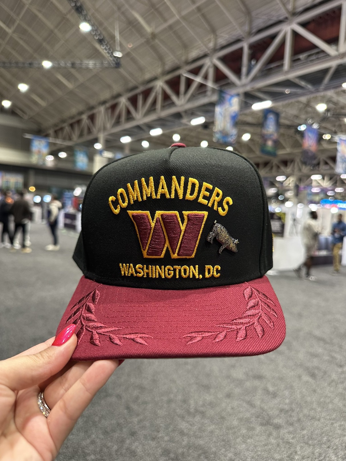
First look at the 2025 Draft Hat. Looks like something my grandfather would wear and he’s been dead for 50 years.
- Joined
- Apr 11, 2009
- Messages
- 55,807
- Reaction score
- 17,399
- Points
- 2,743
- Location
- Greensboro, NC
- Military Branch
- Alma Mater
Jesus
- Joined
- Apr 11, 2009
- Messages
- 55,807
- Reaction score
- 17,399
- Points
- 2,743
- Location
- Greensboro, NC
- Military Branch
- Alma Mater
I mean I’m not sure I would keep that if it were a game day giveaway. They’re off to a helluva start ‘improving’ the brand lol…
- Joined
- Oct 13, 2010
- Messages
- 1,344
- Reaction score
- 2,038
- Points
- 263
- Location
- Mechanicsville, MD
- Alma Mater
^^^that looks like a veterans style hat, especially with the leaf clusters on the bill. I"m a bit skeptical on that hat. Where did the Hog pin come from? lol
- Joined
- Apr 11, 2009
- Messages
- 55,807
- Reaction score
- 17,399
- Points
- 2,743
- Location
- Greensboro, NC
- Military Branch
- Alma Mater
I just don’t get why it’s so hard to come up with great swag. Ive seen stuff posted here today that is 100x more visually appealing than most of the Washington swag. And yeah, I know the team isn’t designing this stuff but it’s still godawful…
Last edited:
Users Who Are Viewing This Thread (Total: 1, Members: 0, Guests: 1)
Who Read This Thread (Total Members: 85) Show all
- SmiffySkins
- HOF44
- Picture Drawer
- NickyJ
- BrotherDP
- Voice_of_Reason
- Blaze Thunderball
- Lupin IV
- LH9060
- SkinsInSATX
- Busch1724
- Spearfeather
- AngryChuckT
- RedWolf
- ArtMonkWasMyHero
- ntotoro
- Faithful Fan
- KitKat
- SkinsGuy99
- Chris
- Hailer
- RedskinInCO
- BabelRich
- Anne The Fan
- burgold
- Canuck
- JoeyG
- Conn
- HTTR
- Ferndaleskins
- Ashburn Dave
- Skintime
- mackjr1962
- pwyl
- Fansince69
- UK Skins
- Boone
- Maglite to the Face
- Duncan
- RFK Lives
- Whiskeypeet
- Ekimotama
- Phantvm
- Single-Bar Facemask
- Skinfanjon
- Rakpo98
- Ben Wyatt
- Kpmjames75
- Knightingale
- Halcyon Times
- 0rder 0f 0ut
- Enforcer
- Captain James
- bowhunter
- skinzplay
- FanSince71
- HailYeah
- COWBOY-KILLA
- McD5
- Primus Porcus
You haven't joined any rooms.