(New Poll) The Washington Commanders Brand 2.0: Beer Drinkers and Hail Raisers

How do you feel about the Commanders Brand 2.0?

  • Vastly improved, if this is THE brand moving forward I’m satisfied.

  • I like the direction, but I still feel more to do. I will/have specified in thread.

  • I don’t like this new direction. I didn’t like the old either. They can’t make this work for me.


Results are only viewable after voting.
Nuff said!

IMG-20260731-WA0022.jpg
 
There is already a Commanders Brand thread, and this article would actually fit in really well into that thread, and it would be great if you made a comment about it when posting it.
 
We are probably going to do poorly in any polls related to the brand or uniforms for a long time. Many folks will dislike anything short of going back to Redskins, and understandably so.

I also wonder if people are ranking the uniforms with last year’s look in mind, I would expect better with our new look, which is sharp.

I think they are doing the best they can by going back to the old uniforms; returning to RFK; retiring #81, #28, and #44; etc. I take it as a good sign Riggo was there flashing the Wetzel logo today, he’s been critical of the new brand in the past, and maybe he still is somewhat, but at least he’s back in tne fold.

 
Last edited:
We are probably going to do poorly in any polls related to the brand or uniforms for a long time. Many folks will dislike anything short of going back to Redskins, and understandably so.

I also wonder if people are ranking the uniforms with last year’s look in mind, I would expect better with our new look, which is sharp.

I think they are doing the best they can by going back to the old uniforms; returning to RFK; retiring #82, #28, and #44; etc. I take it as a good sign Riggo was there flashing the Wetzel logo today, he’s been critical of the new brand in the past, and maybe he still is somewhat, but at least he’s back in tne fold.


That's for damn sure! There is only one RIGGO! ❤️
 
Here's why they should change the name (and actually include the fans' input for real this time, unlike the last time when Snyder ran his sham "poll"):

1. Guns n' Roses used lyrics written by cult serial killer Charles Manson in the song 'Look At Your Game Girl.'

2. Devo used lyrics written by assassin John Hinckley Jr. in the song 'I Desire.'

3. This team was renamed to 'Commanders' by serial sexual harasser Daniel Snyder.

Who wants to be remembered as the team named by one of the worst human beings to ever haunt the DC region?

I forgot one more example since I'm bored:

4. David Bowie named his son Zowie Bowie. I can't imagine the bullying he endured. As soon as he turned 18, he changed his name to Duncan Jones.
 
Dear New Era, '47 Brand, and all other NFL headwear suppliers...

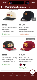
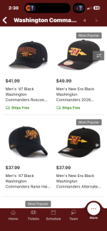
Is is THAT difficult to get a nice, quality mesh back hat with the Hail Raiser logo out into the marketplace? What's the hold up?

#Frustrated in PA
 
Dear New Era, '47 Brand, and all other NFL headwear suppliers...

Is is THAT difficult to get a nice, quality mesh back hat with the Hail Raiser logo out into the marketplace? What's the hold up?

#Frustrated in PA

Go to the team store on the Commanders app man. You don’t like any of those options?

IMG_0925.pngIMG_0923.png
 
I see what you are getting at now. They have adjustable ones but not the “trucker” mesh style. I prefer those as well.
 
If you go back to the original page of this thread and read through them to this point, a lot of the things we said we would like to see gone or changed have been fixed. “Fight for our Commanders” was always goofy sounding, and “Braves on the warpath” fits in the context of what they are trying to do with the Greco-Roman theme.

I also noticed the over and under lines on the Commanders word font has been eliminated in the end zone and now it look more like the Redskins font. Not to mention the team uniforms looked proper on the field again last night.
 
If you go back to the original page of this thread and read through them to this point, a lot of the things we said we would like to see gone or changed have been fixed. “Fight for our Commanders” was always goofy sounding, and “Braves on the warpath” fits in the context of what they are trying to do with the Greco-Roman theme.

I also noticed the over and under lines on the Commanders word font has been eliminated in the end zone and now it look more like the Redskins font. Not to mention the team uniforms looked proper on the field again last night.
Great observation, I myself am pleased tbh but I would still like the font to be exact when it comes to the R, E and S in Commanders.
 

Users Who Are Viewing This Thread (Total: 2, Members: 0, Guests: 2)

Help Users

You haven't joined any rooms.

    You haven't joined any rooms.
    Top