
 }})



When it comes to the helmet colours, I remember when I bought my Alfa Romeo back in 2004. When I ordered it, they asked me what colour I wanted. I was like, Red. Durrr.
Alfa's and Ferraris. Yes, you can get them in other colours, but are they REALLY right if they aren't in red?
I feel the same about the Redskins. Yes, they've playing in a yellow helmet. And yes, they've played in a black helmet.
But if that helmet ain't burgundy, then it ain't really the Redskins (or Commanders! LOL)
The Commanders' helmets always felt off to me, without the yellow facemask and the stripes. I understand the logo had to change, but the colours never truly felt right. Now they do.
I even like the new spear logo. I get the argument for the 'taco holder' not working logically, but again, that's if you take a 2D logo and put it in 3D terms. In truth, the logo is just 4 lines. HAve we seen a 3D version at any point that actually shows it as 4 overlapping lines, where one is behind the other? Have we ever been told that?
I googled (briefly albeit) and I can't find any 3D representation of the logo that shows the lines overlapping. It looks like this...
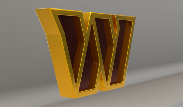
It's just flat. Four Geometric shapes stacked. I've always been of the opinion it was created to look more like a rank symbol. to go with our new military theme. A version of this created as a W.
Like these...
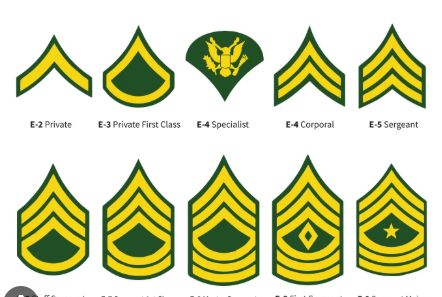
That was always my personal takeaway.
And when treated as a 2D logo in that respect, there's nothing wrong with the spear placement really.
I'm fine with other people having their opinions on it, but this is just my view.
Alfa's and Ferraris. Yes, you can get them in other colours, but are they REALLY right if they aren't in red?
I feel the same about the Redskins. Yes, they've playing in a yellow helmet. And yes, they've played in a black helmet.
But if that helmet ain't burgundy, then it ain't really the Redskins (or Commanders! LOL)
The Commanders' helmets always felt off to me, without the yellow facemask and the stripes. I understand the logo had to change, but the colours never truly felt right. Now they do.
I even like the new spear logo. I get the argument for the 'taco holder' not working logically, but again, that's if you take a 2D logo and put it in 3D terms. In truth, the logo is just 4 lines. HAve we seen a 3D version at any point that actually shows it as 4 overlapping lines, where one is behind the other? Have we ever been told that?
I googled (briefly albeit) and I can't find any 3D representation of the logo that shows the lines overlapping. It looks like this...
It's just flat. Four Geometric shapes stacked. I've always been of the opinion it was created to look more like a rank symbol. to go with our new military theme. A version of this created as a W.
Like these...
That was always my personal takeaway.
And when treated as a 2D logo in that respect, there's nothing wrong with the spear placement really.
I'm fine with other people having their opinions on it, but this is just my view.










