(New Poll) The Washington Commanders Brand 2.0: Beer Drinkers and Hail Raisers

How do you feel about the Commanders Brand 2.0?

  • Vastly improved, if this is THE brand moving forward I’m satisfied.

  • I like the direction, but I still feel more to do. I will/have specified in thread.

  • I don’t like this new direction. I didn’t like the old either. They can’t make this work for me.


Results are only viewable after voting.
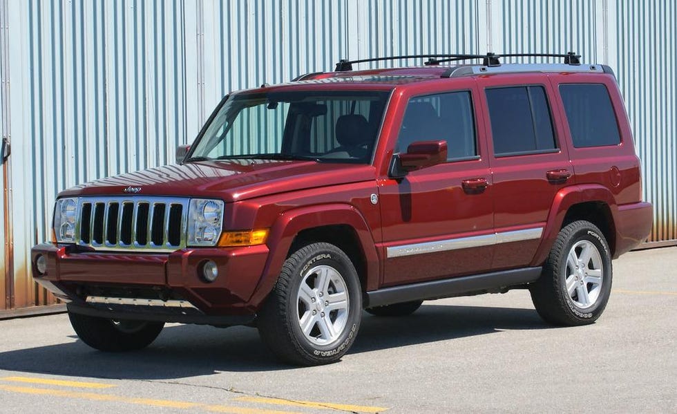
Jeep once made a Commander

2009-jeep-commander-limited-photo-315116-s-986x603.jpg


That might be an awkward looking helmet but it's in the correct color.
 
I worry that ambiguity does not help define a visual identity.
Ambiguity worked with the earliest teams in the NFL; the ones that didn't have an animal for a team name. (Packers, Giants, Browns).

But today, if you want to market a name, you need a symbol that people can wrap their heads around; a visual identity.


Look at these recently created non-animal named teams; like the Titans. They never show an actual Titan. But they put their T in a circle reminiscent of their state flag and set it on fire. They even supplant that logo with an alternate logo that has a sword that looks like a T.
TEN mastered the visual identity without using a being.
I would even argue that we are in the same boat as the Titans when it comes to new branding. We both can't use our old identity, except that we didn't move.

Screen Shot 2025-02-16 at 2.01.29 PM.png
Screen Shot 2025-02-16 at 2.03.30 PM.png


Heck look at the Houston Texans! Nothing is more ambiguous than the residents of the state the team lives in.
And yet they still used a bull as their visual identity, with colors reminiscent of their state flag. The name is bland but the logo is awesome.
Screen Shot 2025-02-16 at 2.06.14 PM.png


When they have a clear visual identity, they could add things like a unique letter H.

Screen Shot 2025-02-16 at 2.08.24 PM.png


Heck teams like Bengals and Bears recently switched up their letter logo and visual logo deciding which one is the primary logo. They can do that because there is no question about what their team is.


We shouldn't act like we were Washington the whole time of our franchise. Because Washington was always attached to Redskins for 88 years Redskins Nowhere in that time was the branding all about Washington itself.
Yes, today we have an opportunity to have Washington itself be represented once and for all. But the team still does need a direction in a visual identity. Not just for marketing, but for people to point to something in the world that is the real life representation of the team.
Look at an eagle, think of the Eagles.
Look at a forty niner, think of the 49ers.
Look at a bull, think of the Texans (or NBA Bulls).
Look at a pirate, think of the Buccaneers or Raiders.
Look at a lightning, think of the Chargers.
Look at New York City, think of the Giants.
Look at a brown Bull Mastiff, think of the Browns.
Look at a mythial creature or maybe a torch, think of the Titans.
Only Packers have something in real life that is not in their branding: cheese.


I am certain the W itself will stay. But we need to supplant that W with either logos that show an actual theme that people don't need to think twice about to give it an identity, or add that W into a symbol that gives it enough visuals to make it become the identity itself.

 
The best identity is consistent success on the field. Accomplish that and no one will give a fig about any fancy or creative helmet logo.
Team performance is its own identity that helps in sales more than making the logo look good.
I look at the branding being a sound visual identity independent of team performance.
Wins, players, coaches, GMs, they all come and go. But the branding is what stays around. And I want a Commanders branding that is satisfactory and something worth wearing whether we win or lose.
 
The W on the helmet is just lame as hell. You can't replace the Redskins helmet logo with that garbage.

I agree, they need a major upgrade.
I think you can’t replace it. So it’s probably best to keep it simple. Very simple like the W or make it so generically simple with a circle-ish logo that from a distance I can pretend it’s Wetzels beautiful creation you can replace the most iconic and beautiful logo in football history.
 
HurQlez, those uniforms are bad ass! I'd gladly adopt those, and use the seal (minus the dates) on the helmet instead of the W. Seal on one side, maybe numbers on the other, or just the seal.
 
Just been looking for some Redskins stuff online (one of you mentioned it was out there) but noticed there's a lot of T-shirts and other clothing with the W in a circle. I know that's one of the suggestions on here, sounds like someone has already adopted it. I can't decide if it's better or worse than just the W.
 
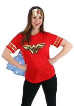
Pretty random, but what if we did something like the Wonder Woman W? After they decided to take the eagle off her costume and went with the W it turned out to be pretty popular.

1739795100439.png
 
Here's the thing. You can only make a letter so exciting, lol... I mean, what's the most exciting single letter in icon/logo history? Good luck figuring that out.

As far as single letter logos go, I think they did a good job with the 'W'. It one of the few things I don't hate about the brand. I actually hope they leave it alone.
 
Here's the thing. You can only make a letter so exciting, lol... I mean, what's the most exciting single letter in icon/logo history? Good luck figuring that out.

As far as single letter logos go, I think they did a good job with the 'W'. It one of the few things I don't hate about the brand. I actually hope they leave it alone.
I don't hate the current "W" either, but wouldn't mind at all seeing a "W" in the font that the marketing team used for "Raise Hail" this year. A font-identifying website calls it, "Linotype Richmond Zierschrift Regular".

Here's one of its publications:
1739802590642.jpeg
 
I don't mind the 'Raise Hail' slogan. But the font looks like something the Nazi's would use to me, lol... This 'brand' is so confusing, quasi-military, quasi-Redskins lineage, quasi-medieval, they have no idea what the name means, lol...
 
To think, if they just switched up one vowel we could have been the most complimentary team in the league.

Let's hear it for the Washington Commenders!
 
I know I’ve said it before but I REALLY like the Raise Hail stuff. I think that is one way they have found that really connects the past to the new in a cool innovative way. The font does look “old world” to me. I’m a bit of an Anglophile so that’s probably why I like it so much.
 
I'm going to be the curmudgeon here. I loath the black uniforms. They have nothing to do with the team history at all. No where close. I know, the kiddies like them, but it's about as far away from the Skins as you can get. I can't stand the bastardized fight song. Either save it for when the name Redskins comes back or commit it to history. The new uniforms? Eh. Seems they have a different color variation for every game. Speaking of colors, go back to the burgundy. That new blood red, eh. The W looks OK but the name, eh. I suspect the NFL and their current state of thinking is probably actively working behind the scenes to keep the name Redskins from ever seeing the light of day again. There, I said it
 
The font does remind me of documents that our Founding Fathers wrote. That is why they used it. I bet any accurate Founding Fathers script is trademarked.
 
I don't mind the 'Raise Hail' slogan. But the font looks like something the Nazi's would use to me, lol... This 'brand' is so confusing, quasi-military, quasi-Redskins lineage, quasi-medieval, they have no idea what the name means, lol...
Nazi Fonts…”Commies” for a nickname…what will they do next huh? :ROFLMAO:
 
I don't mind the 'Raise Hail' slogan. But the font looks like something the Nazi's would use to me, lol... This 'brand' is so confusing, quasi-military, quasi-Redskins lineage, quasi-medieval, they have no idea what the name means, lol...
I think they were going for a stylized version of colonial script, kinda like this:

Constitution-Day-Event-2024.jpg
 

Users Who Are Viewing This Thread (Total: 5, Members: 0, Guests: 5)

Help Users

You haven't joined any rooms.

    You haven't joined any rooms.
    Top